

PROJECT OVERVIEW
Design a responsive online platform for a magazine, newspaper, or blog directed to meet the needs and goals of one of the presented User Personas.
TEAM
Jabneel Díaz - User Research | Interaction Design | UI Design
Albert Burks - User Research | Interaction Design | UI Design


User Persona
The user persona selected for this project is Elaine. She’s a young working professional interested in self-care and self-love, who volunteers for the community and has as goals be more rational, discover new passions, and achieve a good work-life balance.

Brainstorm
Based on the information provided for this persona, Albert and I analyzed Elaine’s goals, routine details, and lifestyle. After discussing possible topics of interest for this persona, we concluded that a wellness and mindfulness online magazine would be a product that would fit Elaine.
Research
The research started by looking for available online publications focused on wellness and mindfulness. Out of all the results we found, we decided to use Self and Mindful magazines along with two of the publications this persona often reads, National Geographic and The New Yorker, for further research and analysis.
Branding Comparison
To get an understanding of what each one of these online publications has to offer, who their target audience is, and how they can fit our user persona’s goals and wants, we did a Branding Comparison.

We learned that these publications mostly focus on educated people with liberal beliefs tendencies. They offer good quality content and have a very defined brand style in place.
Feature Comparison
Comparing each publication’s features helped us start thinking of functionalities our product must have and opportunities for new features.

Key Takeaways
All publications have the option to subscribe to the magazine and newsletter.
Two out of the four have their articles in audio version.
All publications provide user account creation.
Ideation
Having this information in hand, we started ideating.
Albert and I used the Impact vs Effort Priority Matrix and the Moscow Method to prioritize the features we’d be including in the design.

First, we used the Impact vs Effort tool to analyze which feature would give us the highest impact with the lowest effort. Features on that scope: Audio articles, user account capabilities, magazine subscription, and newsletter sign-up.
Then, using the Moscow Method, we organized the features in the four quadrants of Must Have, Should Have, Could Have, and Won’t Have.

MVP
Our work up until this point led us to define the Minimum Viable Product (MVP) statement.

Site Map
To define the information architecture of the website, we put together a site map.
Here defined the sub-sections and how the menu would be distributed in terms of the main content buckets.

User Flow
For the User Flow, we decided to focus on two main tasks:
Starting on the homepage, the user will visit the mindfulness section, click on a specific article, and play the audio version.
Then, from there, the user will decide to subscribe to the magazine.

These two tasks are interconnected in one flow.
Concept Sketches
Albert and I did some research to look for inspiration and the latest trends before starting sketching.

Mid-Fi
With an idea of how we wanted the website to look like, we started designing the mid-fi version.
It was a very simple layout. The homepage would feature a carousel and three articles per main content section.
However, halfway through the design, we decided to do some more research in a quest for additional inspiration.
As a result of that research, the design was changed to incorporate content cards.
Also, the layout was changed to a more dynamic one.
Mid-Fi Revisited

Usability Test
After finishing the first mid-fidelity prototype, we conducted 5 in-person usability tests. They pointed out five main things we later implemented.
Add the word “menu” to the header to make it more clear where to find it.
Add credential creation at the moment of subscribing.
Add password confirmation.
Add the capability of sharing articles.
Add the option to subscribe in another place other than just the top right corner.
These changes were applied to the new mid-fi version shown above.
Brand Building
To start building the brand, Albert and I started with a Visual Competitive Analysis.

This analysis helped us understand the design elements competitors were using, like their color palette, imagery, button design, typography, etc.
For publications like National Geographic, pictures are very important and play a main role in their design. However, Mindful and The New Yorker have a mix of pictures and illustrations very characteristic to their brand.
Brand Attributes
For our magazine brand, we wanted to reflect the following attributes: Inclusive, friendly, understanding, informative.

These were based on Elaine, the user persona selected for the project. She wants to be good to others to create a more empathetic society. Therefore, a magazine that projects inclusivity, an understanding of diversity, it’s friendly to others, and doesn’t look for confrontation, will suit Elaine’s wants and goals.
Moodboard
Based on these four attributes, we went again in search of inspiration.

Color Palette
The mood board provided the foundation for the colors we used in the design. The two main colors were dark blue and coral.

Blue is often viewed as a non-threatening color and calls to mind feelings of calmness or serenity. It is often described as peaceful, tranquil, secure, and orderly.
Coral is, for most people, perceived as a largely positive color. Warm, dynamic, and invigorating, it blends the femininity of pink with the optimism and energy of orange.
These colors support the brand attributes of inclusive, friendly, informative, and understanding.
Typography
To not overcomplicate the process, we used Google Fonts to find the perfect font combination for the project.

After analyzing which combination made more sense to us, we decided to go with Syncopate, Inter, and Spectral; one Serif and two Sans Serif.

Brand Name and Logo

For the brand name, we thought of the big main goal of the product: to help people become a better version of themselves through wellness, mindfulness education, and practice.
With this as our focus, we brainstormed until we got to the word “unravel”. Unravel is defined as “undo (twisted, knitted, or woven threads)” or to “investigate and solve or explain (something complicated or puzzling).”
To us, unravel was the perfect word that encompasses all this magazine needs to be and provide: tools to undo what’s no longer serving a person and the necessary information to investigate and solve something as complicated as ourselves.
Having defined the name, the logo creation came along.
We tried different options until we got to the final version. The font used (Syncopate) and its simplicity gave the logo a modern touch and a youthful feel perfect for the target audience of the publication.

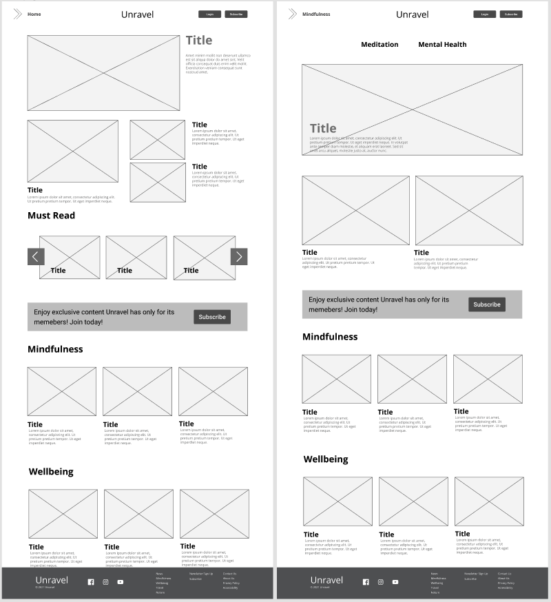
Hi-Fi
As we went applying the UI to the mid-fidelity prototype, some elements of the original design were transforming and adapting as we came up with new ideas and saw how everything was coming together.
Using the color palette, hand-made strokes and shapes were created and added to the Subscribe banners across the publication. This gave a unique touch to the design. Also, thin lines were included across the pages and elements to emblem the meaning of “unravel”.

Responsive Design
As part of the challenge, Albert and I also designed the responsive versions for iPad and iPhone.

Desirability Test Results
After finishing designing the magazine, we did a Desirability Test on four people to assess users’ attitudes toward aesthetics and visual appeal. These were the results:

Common words among the users were: Appealing, Creative, Friendly, and Useful.
Next Steps
Design an app for the publication.
Add a shop.
Define more the visual aspect in terms of photo style and illustrations.
Add more topic segments.
Successful Metrics
Website visits
Session duration
Bounce rate
Pageviews
Subscriptions

