

PROJECT OVERVIEW
We were required to conduct user research to understand people’s relationship with mental, physical, and emotional well-being in order to develop a tool that will drive them to action.
As designers, we had to reimagine how people can adopt and maintain a routine that enhances their well-being.
TEAM
Jabneel Díaz - User Research | Interaction Design | UI Design
Samantha Davis - User Research | Interaction Design | UI Design

Audience
Since being healthy and well is a matter that can apply to any individual, Samantha and I decided to focus on a very specific target group: people born from 1990 onward. This means that young Millennials (those born from 1990 to 1996) and the new Generation Z (born from 1997 onward) This means that young Millennials (those born from 1990 to 1996) and the new Generation Z (born from 1997 onward) were part of the group selected for this app. Even though they’re mostly healthy people, finding a way to get them to start integrating health and wellness behaviors early into their lives could result in a healthier lifestyle later on.
With this audience segmentation defined, we started our research.
Secondary Research
To understand the health and wellness app market, we started conducting secondary research. We were able to gather good information about the amount of health and wellness apps in the market as well as some key factors that motivate people to commit to physical activity. Here are some key findings:
The mHealth app (Medical) market is getting crowded reaching 259,000 apps. However, the overall number of downloads of such apps appears to be decreasing.
“Sharing posts and receiving encouragement provides the social support many people need to stay motivated with exercise programs — and this doesn’t change across different age groups,” says study co-author Dr. Ivanka Prichard, from Flinders University’s Caring Futures Institute.
A study shows that the social components of physical activity apps are particularly beneficial in promoting engagement in physical activity due to their capacity to facilitate social support and positively influence motivation and beliefs in one’s ability to perform physical activity.
Online interactions can have a negative effect on people who exercise if social networking is used to make direct comparisons.
Feature Comparison
After browsing dozens of mHealth apps, we picked five apps that are widely used to compare and analyze: Flo, Apple Health, Headspace, MyFitnessPal, and Noom.

Here, we were able to recognize some user’s mental models and areas of opportunity. For example, all apps provide reminders to help people complete their tasks/goals. Also activity tracking, a key feature also expected by users.
Two clear areas of opportunities are gamification and friends' connections.
Brand Comparison
Even though all of these apps fall under the realm of Health & Wellness, each one provides a different service to users.

With the exception of the Apple Health app, which is a data-tracking system and aggregator, all of them are available for iOS and Android users.
Flo, specifically, is an app solely for women. It’s focused on the menstrual cycle, fertility, contraceptives, and any topic related to women’s intimate needs. It has a non-judgemental forum where the users can talk about their situations and get support from the community.
All five apps have millions of users and a minimum rating of 4.7.
Market Positioning
To identify where potential competitors are positioned in the market, we used a Market Positioning Chart. The considered value points in this chart are luxury vs value and traditional vs innovative.

All selected competitors were positioned in their respective places within the market which allowed us to find a Blue Ocean of open market where our product could fall, this being value and innovation.
Affinity Diagram
To dive into our own research, five one-on-one interviews were conducted. The information was organized in an Affinity Diagram to find patterns and commonalities among the answers.

Key Takeaways:
People want to track development and improvement over time. They want to build habits and see how those actions impact their lives over a long period of time.
Interviewees are motivated by others and crave community. They want to be able to share experiences and grow with others.
People want a routine and consistency.
People believe mental well-being and physical well-being go hand in hand. The two work together; separating them is not productive.
Simple tracking habits like steps, calorie counting, total physical activity time, and heart rate are the main focus.
Most people use the Apple Watch to track physical activities.

Value Proposition Canvas — Customer Profile
To ensure the product we’ll be developing meets customer's values and needs, we used a Value Proposition Canvas. At this point in the process, we started with the Customer Profile part of the canvas to continue building our target customer.

Along with the pains and gains identified in the Affinity Diagram, in the Customer Jobs section of the Customer Profile, were included jobs with both functional and emotional aspects. For example, feeling accomplished would be an emotional job for a user while tracking daily habits and tasks would be a functional job.
User Persona
Based on the research we created our User Persona. Tepid Tami is a young professional in her early 20s who represents our focus target group, which is comprised of younger Millennials and Gen Zs.
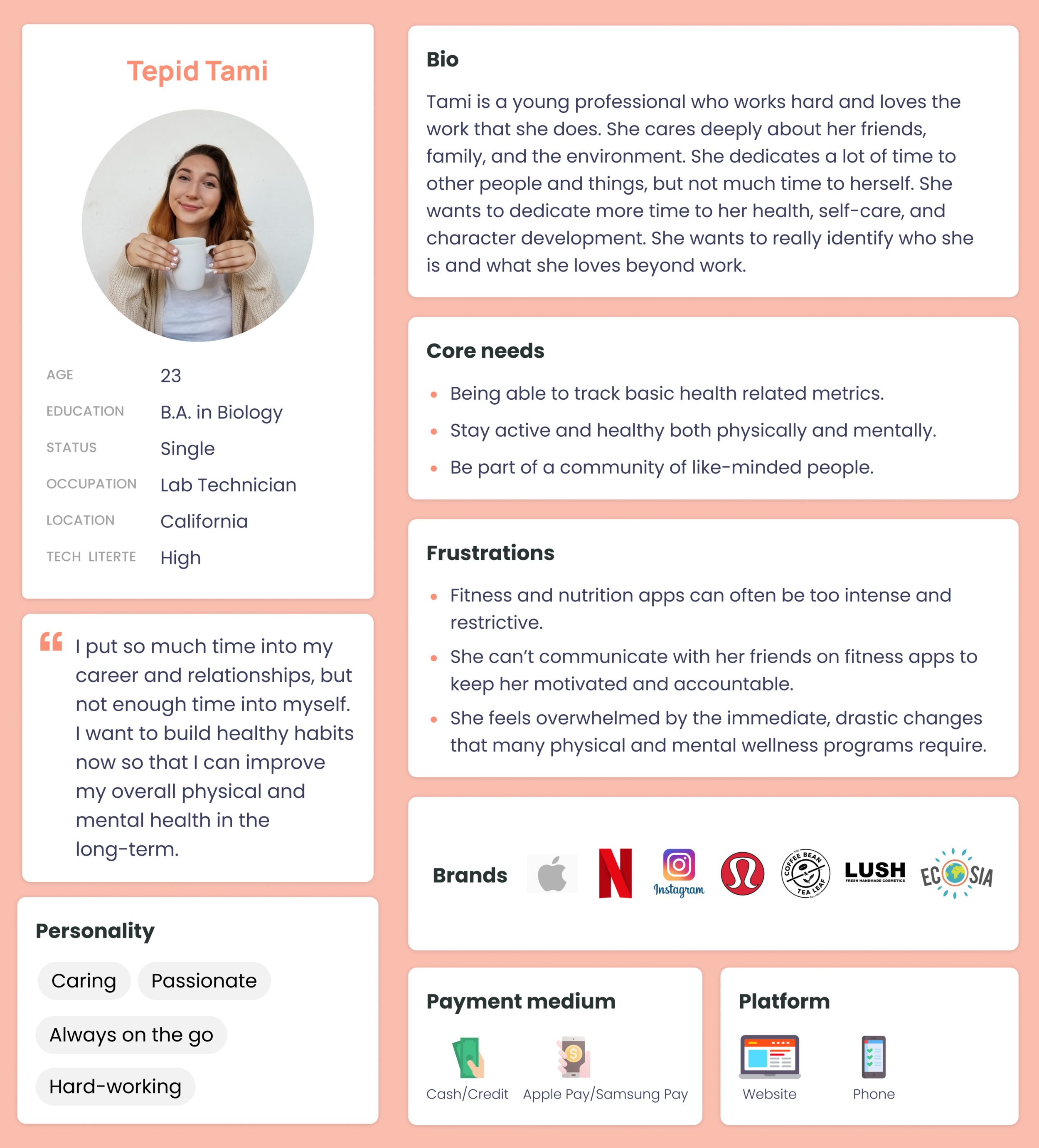
Although Tami is a young adult, she is very conscious of her health and wellbeing. Early in her life, she wants to start taking care of her body and mental health.
Some of her frustrations are how intense and restrictive some fitness and nutrition apps can be and the lack of in-app friends interactions to keep her motivated and accountable.
Journey Map
For Tami’s Journey Map, we decided to picture what usually happens at the end of each year where people make a list of resolutions and goals they want to achieve as soon as the new year starts.

This process helped us to find design opportunities based on the down points in the journey. These are:
Add gamification to entertain and motivate users.
Friend invites/connections.
Encouragement from friends to complete goals.
Wearable integrations.
Character in action while performing a habit.
Before moving on, I’d like to define the concept of gamification so it’s understood as you continue reading the case study.
Gamification is the application of typical elements of game playing (e.g. point scoring, competition with others, rules of play) to other areas of activity, typically as an online marketing technique to encourage engagement with a product or service.
Problem Statement
Based on our research, a problem statement was created.

With this defined, we went ahead and created three How Might We to start narrowing down the direction of the design.
How Might We
With this series of HMWs, Samantha and I started to brainstorm about how might we help the users with their health and wellness routines.

Impact vs Effort
As part of our prioritization process, we placed in an Impact vs Effort chart the different features we considered could be included in the product.

The next step was defining the Must Have, Could Have, Should Have, and Won’t Have features using the MoSCoW Method.
MoSCow Method
Using the Impact vs Effort chart as the foundation, the feature prioritization was defined.

As Must Have, a habit reminder, habits tracker, friends accountability, and a gamification approach were selected.
Value Proposition Canvas — Product Market Fit
With a set of possible solutions in hand, we went back to the Value Proposition Canvas to fill out the Product & Services along with Gain Creators and Pain Relievers to find a product-market fit.
We were able to find a solution to each customer's job as well as to gains and pains.
Minimum Viable Product
At this point in the process, we defined what the Minimum Viable Product was going to be.

User Flows
Samantha and I decided to create two user flow to showcase the basic functionalities of the app.
The first flow takes the user from the initial screen, which is an illustration users will see as the app loads to the login or create an account options. Next, a character is selected and the user will arrive to a tutorial with some activity selection previous to fully entering into the app.
Flow #1

The second flow is a very simple notification path. A user receives a notification reminding a previously selected activity, an action is taken, in this case, marking the activity as completed, and landing to the app’s Home Screen.
Flow #2

Concept Sketches
Our next step was to sketch our ideas out into paper.

Tamagotchi Digital Pet

As part of our inspiration for the app, we traveled back in time to the ’90s and revisited the famous digital pet called Tamagotchi.
The idea goes around attaching your pet’s life to your activity performance. The better you do, the happier the character will be. Here’s where we applied gamification to the app.
However, in our app, the pet won’t die. Its mood will vary as you miss or achieve your selected activities. So in order to maintain a happy pet, you’ll need to accomplish your goals.
Mid Fidelity Prototype
We translated the concept sketches to a mid-fi version of the two previously defined user flows.
Flow #1

Flow #2

Usability Test Results
Samantha and I uploaded the prototype into Maze and conducted six usability tests. Overall, users had positive experiences with the app. However, they provided very good feedback that later was applied to the design.
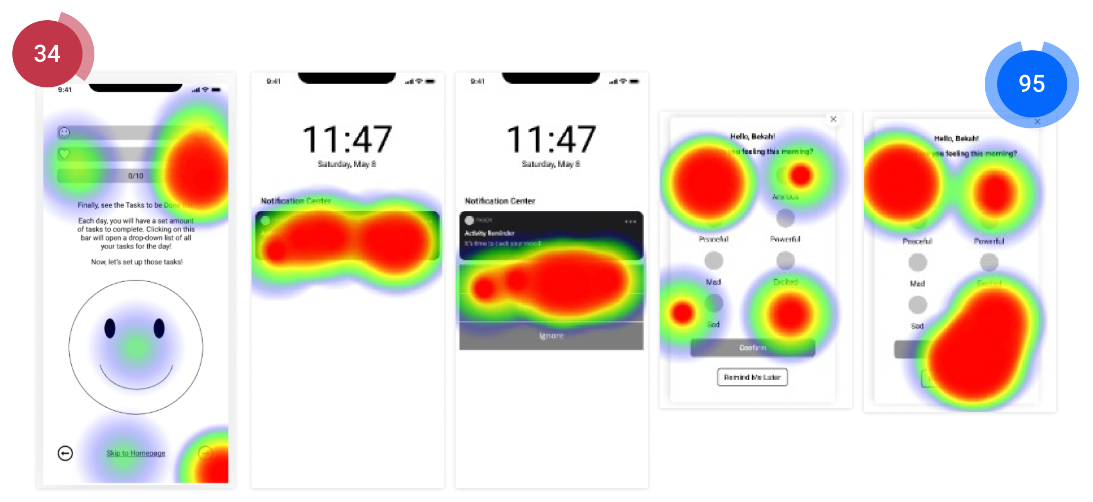
Key Takeaways:
They liked the tutorial and the app’s general purpose, but found the tutorial misleading.
We needed to be clearer about the end goal of the flow from the beginning and guide the user through the introduction to the home page with more clarity.
The mood tracker lacked depth.

Visual Competitive Analysis
With the Mid-Fidelity prototype complete, we entered the UI phase.
We began with a Visual Competitive Analysis to identify similarities and differences in the UI of the health and wellness apps previously selected for the project.

This process also helped us understand each app’s style design, color palette, typography, and how they presented the information to the users.
Brand Attributes
For the brand attributes, we wanted the app to be perceived as engaging, fun, supportive, evolving, and young.

These attributes will also guide our design decisions along the way.
Moodboard
We looked for inspiration and created a mood board that represented our Brand Attributes. This process also led us to an idea of how the app might look like.

The images and illustrations also represented how we wanted the app to be perceived by the users.
Desirability Test
To confirm that our mood board reflected the chosen brand attributes, we conducted a desirability test.

We put the mood board in front of eight users and the most common descriptions were: optimistic, inspiring, calm, motivating, and meaningful. These aligned with how we wanted users to experience the app. Therefore, it would become the basis for our UI design.
Typography & Color Palette
For the typography, we looked for a playful and young typeface to be used as the main logo. We agreed that Escalope typeface reflects those characteristics.
When it comes to the app’s written content, we concurred on a simple and clean typeface, in this case, Poppins, that would make everything easy to read, maintaining the colors and the rest of the design as the primary focus.

Originally, a simpler color palette was selected. It was dominated by warm colors. However, as the design progressed, the color palette did as well.
Style Tile
A style tile was created to show how the UI design was taking shape. Samples of the typography, color palette, activity cards, app icon, and possible panda character, were included.

Design System
A design system was created to maintain consistency in the design and keep all micro-interactions organized in one place.
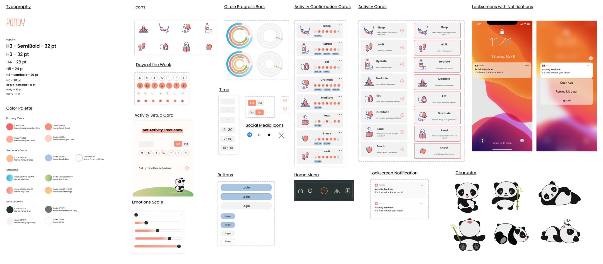

Micro-interactions
All design micro-iterations were not deleted, only moved from the design system page to a dedicated one for assets “Not in Use”. This way, we could go back to any assets we previously discarded and bring them back to our design system if needed.
Here are some of the micro-interactions created that made the final app design.

Hi-Fidelity Version
We created the first high-fidelity version of the app called Pandy. As mentioned before, the main flow would take the user through a guided tutorial helping them set up their first mood tracking reminder as well as three sets of activities.

After presenting the final version, we got very good feedback in terms of micro-interactions and the general purpose of the app. However, some of the constructive feedback received was the following:
More padding on the onboarding form.
Add more brand elements to the onboarding process.
Remove extra steps on the guided tutorial.
Develop the UI more and apply it throughout the design.
Hi-Fi Iteration
As the project came to an end, I went back and reviewed the process. I took the feedback given and iterated for the next few days.

The changes aren’t so drastic. If that had been the case, the app and concept would’ve changed considerably. However, I was able to develop the brand a little bit more and also consolidate the main flow. I ended with fewer screens than the original hi-fi version.
A couple more screens were designed to show how the character would behave if the user doesn’t complete the tasks as set up.

Next Steps
After iterating in the design and flow, these would be the steps I’d do next:
Put the new flow to test.
Develop pet characters with more emotional states.
Add more activities and the option for customization.
Wearables integration.
Activity tracking, like step counting, calorie counting, time meditating, etc.
Success Metrics
App downloads
User engagement
Increase in friend connections
4-5 star rating on App Store

